
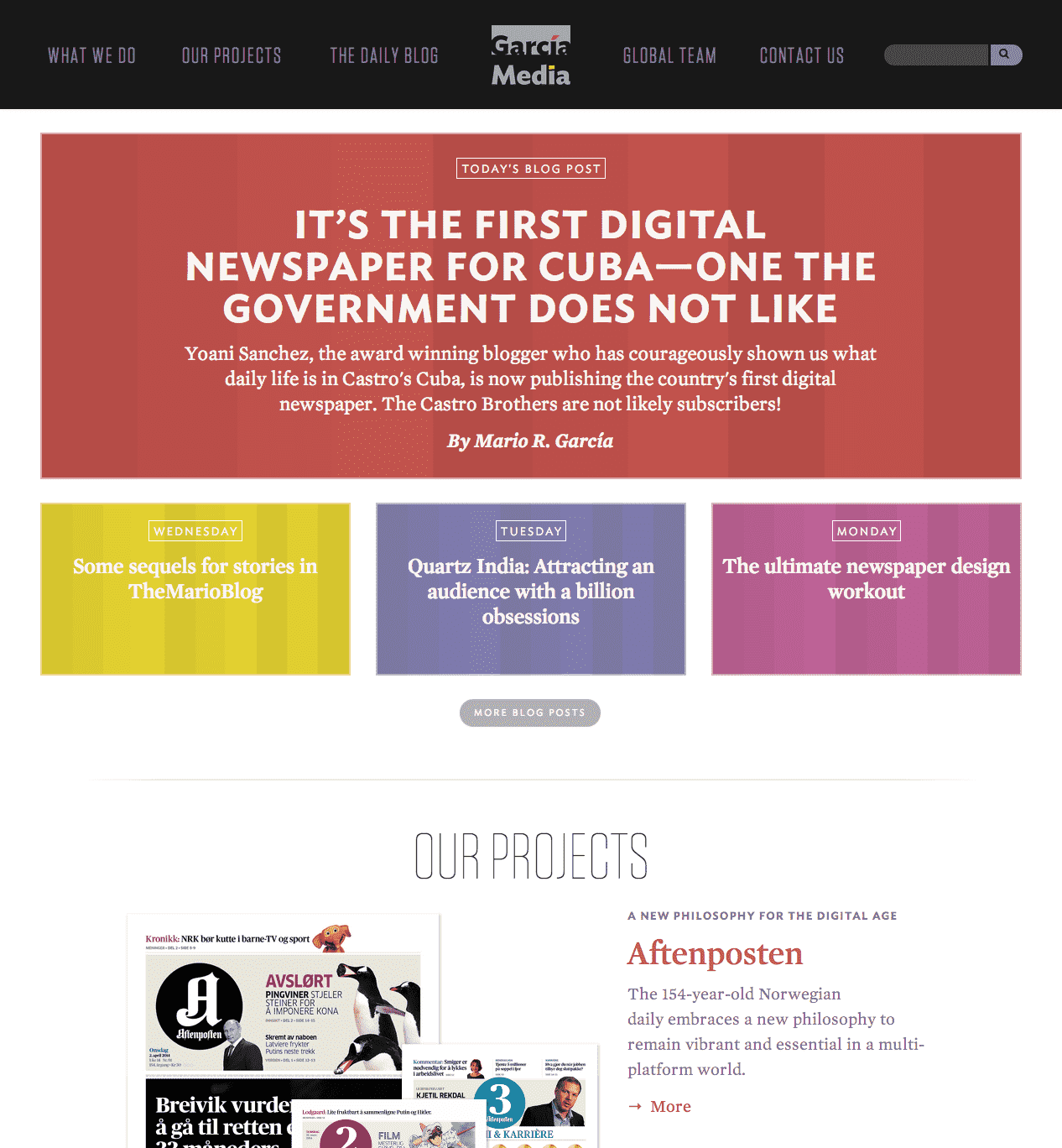
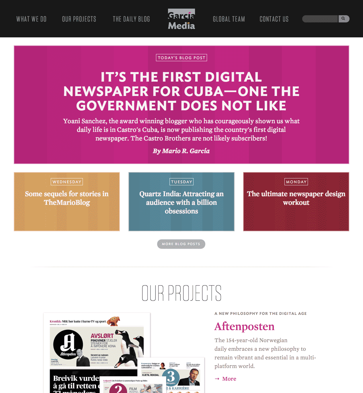
In rethinking the García website, we focused on two goals: creating a contemporary and vibrant showcase for our work and daily blog posts, and practicing what we preach with a mobile-first responsive website. I led design and development for the new website, building out most of the HTML and CSS. CEO and founder Mario García provided creative direction, and I worked closely with our art director Constantin Eberle on the visuals and with developer Christopher Kennedy on integrating the ExpressionEngine CMS.
The new website launched in April 2014. I was flattered that Ethan Marcotte, whose book on responsive web design was one of my key reference points, tweeted his approval:
*Really* enjoying the responsive redesign of @drmariorgarcia’s site: http://t.co/yCu8CR9fqx
(Info: http://t.co/psZTwKCR03)
/via @hoeflerco
— Responsive Design (@RWD) April 21, 2014I began with research on our current site—a user survey, stakeholder interviews, reviewing and analyzing our metrics. Next, I created wireframes for the main page types and started building them out in code with Bootstrap.


Constantin and I passed mobile and desktop mock-ups back and forth until we were satisfied with the visual direction. I then created the CSS to add the look and feel to the wireframe.
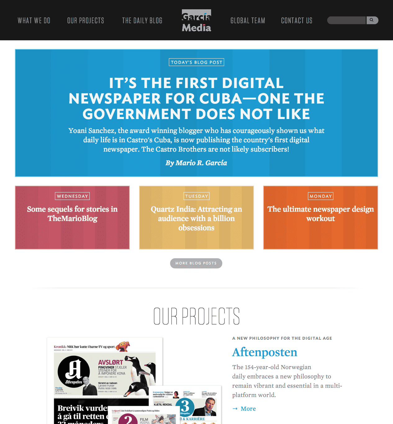


I also designed, edited, and built a new responsive “dossier” or portfolio, explaining García Media’s philosophy and highlighting key projects.

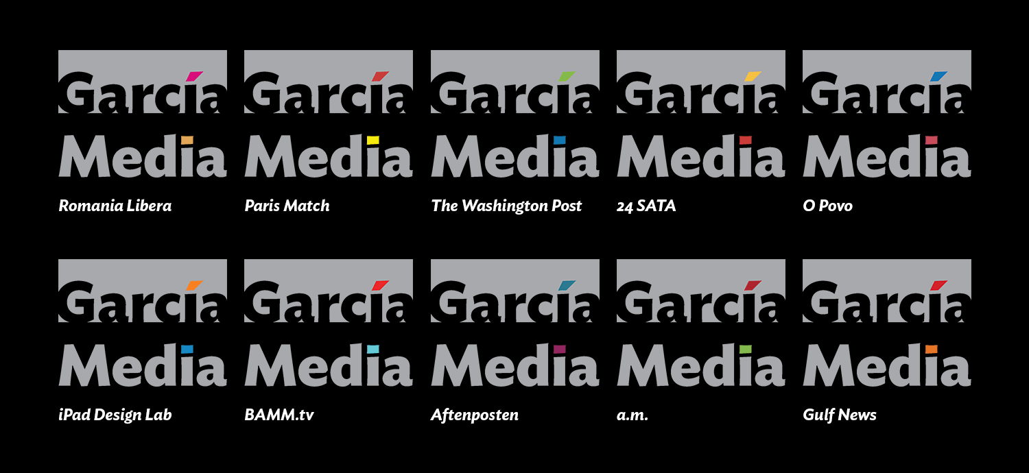
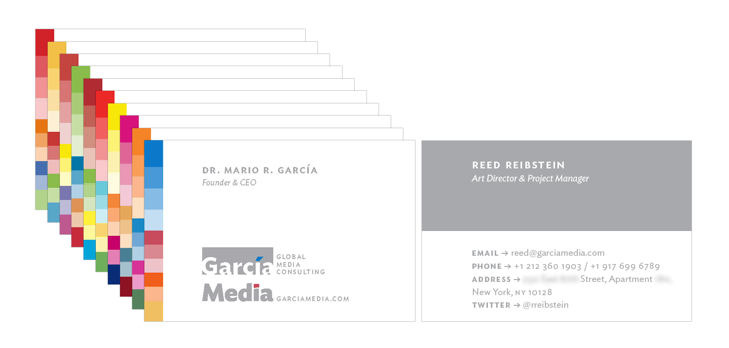
With input from my colleagues, I created the new visual identity for García Media. As used on the website, the identity system features multiple color palettes inspired by notable past projects. The type palette centers on Ideal Sans, a warm but robust sans, and complements it with the serif Mercury Display/Text and touches of the condensed Tungsten.
